The expert team from the ColorDesignStudio has incorporated 28 colours into the current trend selection for wall design. The overall impression is calm, subdued, relaxed. The home as a place to run down. But not with boredom: Jaw-droppers, such as the intensive royal blue or also cognac are in the trend. "Blue has already been in fashion for quite a while and still keeps coming," explained architect, Sybille Abel. "The loud green of years past will no longer be present in 2017. Instead terracotta is coming again, but without the Mediterranean orange-brown touch of a few years ago and is now interpreted with modern cool shades."
Four colour worlds as inspiration
Four colour worlds have been compiled from sixteen principal colours. No general solutions, but rather ideas and suggestions for successful harmonies. Each of the four colour worlds bears with it certain aspects on colour.
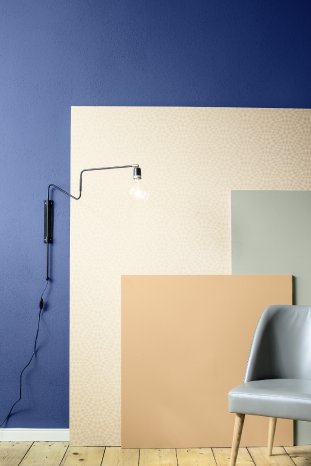
Eye-catcher – earth, blue and khaki
Earthy and natural, warm and homely – but with an up-to-date touch: Terracotta is reinvented in pastel shades without Mediterranean gravity, but with a modern interpretation in retro style. Khaki accentuates the colour world. A powerful royal blue gives a lively freshness.
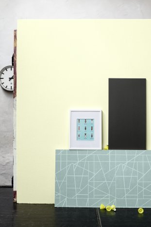
Eye-catcher – mint, yellow and apricot
The pastel world of the '50s now appears sporty and cool. Mint, apricot and a bright, effervescent yellow combine to produce fresh, light modernity. An extraordinary contrast is generated by anthracite.
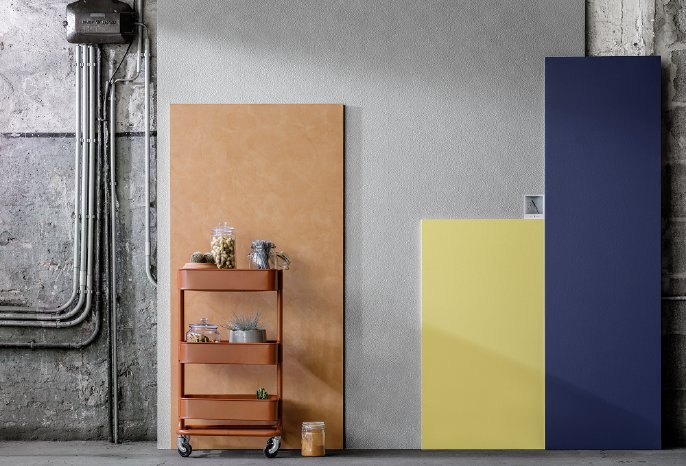
Eye-catcher – cognac, blue and yellow
Cognac – the trend nuance signifies fine leather. Combining it with a light grey nuance makes it radiate. A deep, intensive blue reinforces the exclusivity of this colour world. The softly subdued curry yellow lends a light-hearted charisma to the appearance.
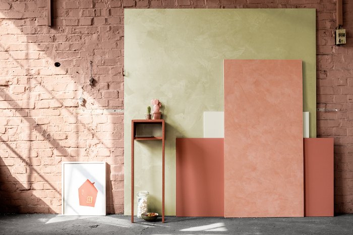
Eye-catcher – red and reed
Can red be soft and harmonious? Yes, it can! Here, red does not set the tone alone, because the trend is towards a combination of nuances. For example, an intensive sorbet red and a soft pastel variant. Off-white makes the colours radiate, mild reed generates a pleasing togetherness.
It all depends on the combination – and here the Caparol ColorDesignStudio is the competent partner for architecture and the application trade. The painter and the architect are familiar with the individual preferences of their customers and with the specific requirements of the most varied rooms. They are on hand with their expertise. The four colour worlds give way to successful compilations for inspiration which however in no way exhaust the scope of the colour trends. Even individual colours can be combined together within a world. If you so desire, you can seek out you own favourites from the whole 28 colours. "The trend colours can and should be used individually," emphasises Sybille Abel. Each combination produces a further spatial experience, a new atmosphere. In addition there are other ways of influencing the room design with exciting surfaces in shades of the trend colours – from rough and glossy through satin matt, from silky shimmering to rustic and elegant.
Innovative medium for the decorating trade – Caparol UNIKAT
To simplify using the trend colour worlds the Caparol ColorDesignStudio has developed something really new: the Project Book Caparol UNIKAT is a useful companion for painters and architects alike, providing them with a guide, memory aid and tool when advising customers. A mixture of trade journal, notebook and brochure in A5 format, giving motivation for colours and fun in designing. The book starts by showing the new trend colours and colour worlds in many attractive pictures and combinations, specifically, for example in one of the colour worlds, with a loft conversion to a studio. Then follows a notebook section with 200 pages as well as colour cards, practical adhesive dots and it finishes with a few pages giving useful tips and suggestions. A must-have then, not only for the painter, but also for architects and private customers. With its appealing design all colour freaks now have a practical every-day companion.
On the Caparol inspiration page www.caparol.de/unikat1 you will find more exciting and inspiring stories about Caparol trends and colour worlds for 2017.


